
Picture two business owners on a Monday morning.
The first spends the first hour of the day scrolling through WhatsApp messages from branch managers, flipping through notebooks, and trying to remember what last week's sales looked like compared to the week before. By the time she has a rough picture, half the morning is gone.
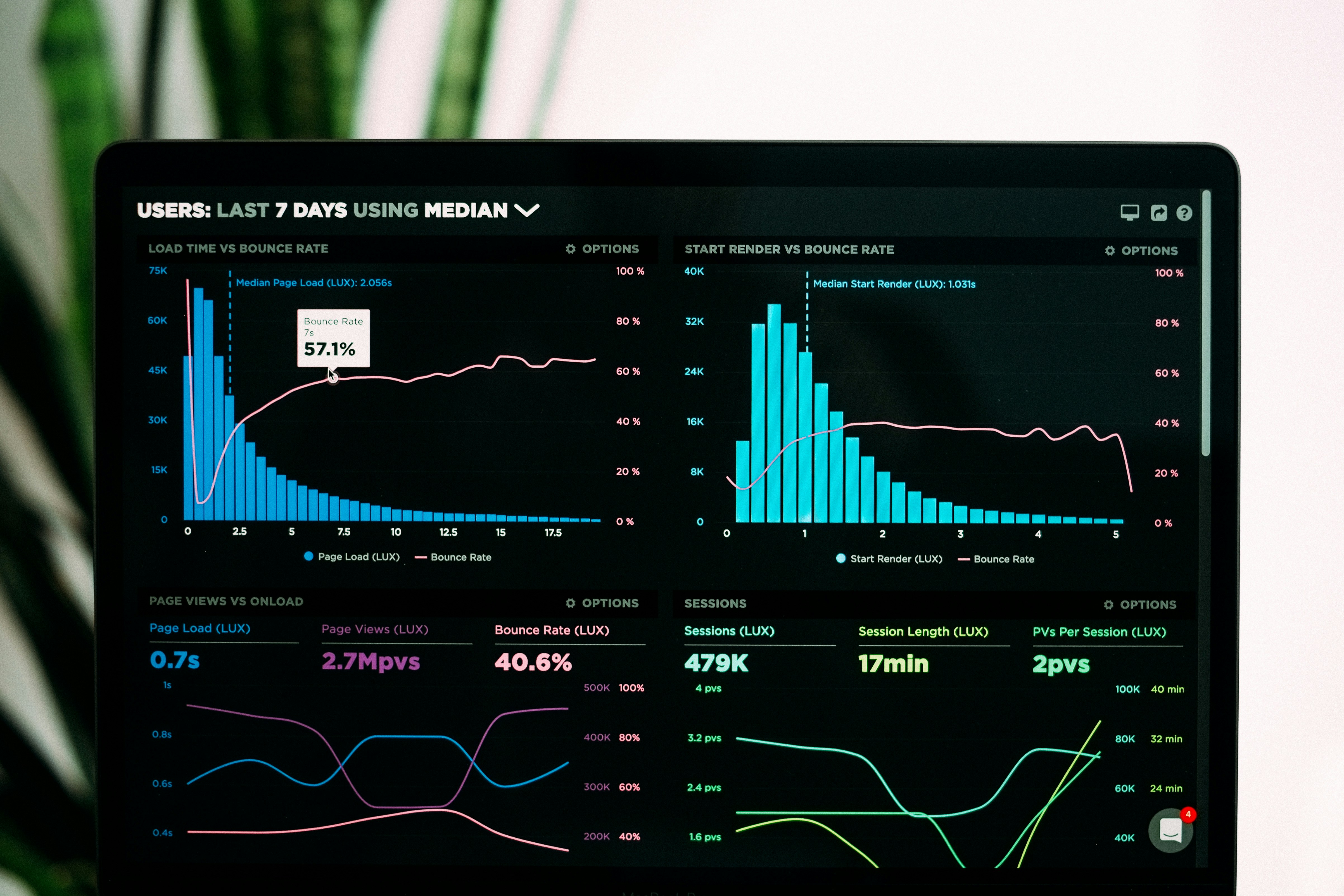
The second opens a single screen. In seconds, she sees which products sold well last week, which branch underperformed, and which supplier delivered late. She spends her morning acting on that information instead of hunting for it.
That single screen is a dashboard. And the difference between these two mornings is not a small one.
Research on business decision-making consistently shows the same pattern: organizations that use dashboards and analytics tools make decisions roughly five times faster than those relying on manual reporting. Companies using real-time dashboards report acting faster during disruptions, and executives using dashboards for daily decisions grew from 48% to 67% between 2023 and 2025 alone. Notably, small and medium businesses are now the fastest-growing adopters of these tools, with SME dashboard and analytics adoption growing faster than any other business segment.
So what actually makes a dashboard different from, say, a report?
A report is a snapshot of the past, usually static, usually arriving after the moment it describes has already passed. A dashboard is alive. It pulls from your business's real activity, continuously, and presents it visually so patterns are immediately obvious, without requiring anyone to interpret rows of numbers. A rising line means something is improving. A red indicator means something needs attention now, not next month.
This matters because most business owners are not short on effort. They're short on time and clarity. A dashboard doesn't replace judgment or experience, it removes the guesswork of finding the numbers in the first place, so that judgment and experience can actually be applied to something accurate.
For a shop, that might mean seeing which products are moving and which are dead stock, at a glance. For a cooperative, it might mean seeing yield trends across farms in one view. For a clinic, it might mean seeing patient flow and resource needs before they become emergencies.
The businesses pulling ahead aren't necessarily working harder. They're simply spending less time looking for answers, and more time acting on them.
In our next article, we'll go one level deeper: which numbers actually matter. Not every metric deserves a place on a dashboard, and we'll look at how to separate the KPIs that drive real decisions from the ones that just look impressive.